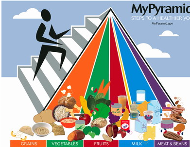
This week, there has been a lot of talk about the USDA's nutrition guidelines. The great pyramid of my childhood has been revised. I mean, let's be honest, this was crazy:
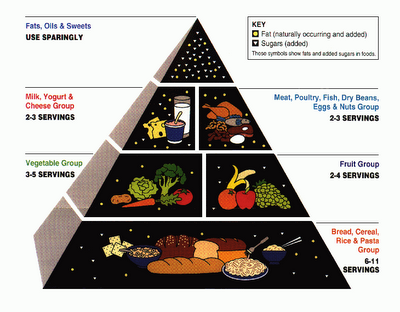
I remember looking at this kind of pyramid as a kid in my public school cafeteria and would feel a pang of anxiety. My good-girl, type-A over-achieving, follow the rules and guidelines self would heap pasta onto her plate in a spasm of fear about how I would eat the recommended 11 servings of graina along with everything else I had to eat to be "healthy." Fortunately, the carb overload would calm me down just enough to nearly fall asleep in my afternoon classes. Sometimes I wonder how my kid self would have responded to this, revised pyramid:
Huh? Wait, that's just a big pile of food. A big pile of food and some colors that appear to be beaming down from the heavens. Why are some of the items illustrated and others photographs? Were there only clip-art carrots but not apples? Did they just do a Google image search for "bread" and stick in the first result? And excuse me, but what are those little blobs emanating from the purple beam and why are they also floating around the green beam? And why is there a photograph of canola oil in the milk section? Or is it in the fruit section? And what's with the stick figure? Are we supposed to climb something? Perhaps he's going up to the heavens to ask the gods for some key to understanding the great mystery of how this was ever considered an "improvement" or how anyone ever conceived that such a chart would be at all helpful. Or maybe this new pyramid tells us what we all needed to know: THROW ALL YOUR FOOD ON THE FLOOR AND GO CLIMB SOME STAIRS, YOU FATTIES! (thanks Fitbomb).
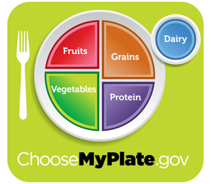
Somebody apparently, was also confused, and so the USDA released its new, revised nutrition guideline visualization. Behold:
Welcome to the "My Plate" revolution, the new panacea of nutrition information. So clean, so simple, so not a pyramid! "What's easier to understand than a plate?" our First Lady asks when this was unveiled this week. This is what our plate should look like, we are told. This is the way to good health; half a plate of vegetables and fruit, half a plate of grains and protein, and a little dairy on the side. Simple, right? Easy to follow. We've hit graphic design gold! But wait, I'm confused again. Doesn't dairy have protein in it? Don't grains? Don't some veggies, too? Are beans a veggie or a protein? Also, where are the fats? Is butter "dairy" and margarine, since it's made from soy "protein"? Let me put it in terms of something familair to school children, the standardized test:
Which of these items does not fit in the series?
Fruits, Vegetables, Grains, Protein, Dairy
a) Dairy
b) Grains
c) Protein
d) None of the above
Yeah, that's right, protein. Why? Because fruits, veggies, grains, and dairy are foods; protein isn't a food, it's a nutrient. It's in foods. In point of fact, there is protein in foods from each of the food categories on the chart. Now, I do think that protein here is probably being used as a euphemism for meat, but meat is not comprehensive enough. What about fish or eggs? And what about vegetarians? And can't dairy count as a protein? See the quandary? What I'm getting at here is that food is more complex than this graphic can reasonably handle. The simplicity of this graphic leaves room fr the kinds of absurdity Bill Cosby points out in his famous routine where, instead of cooking breakfast for his children, Bill gives them chocolate cake and grapefruit juice. By the standards of MyPlate, his wife would have no cause to admonish him: cake has a bit of protein from eggs, has a hearty serving of grains, and a serving of dairy. With the addition of the grapefruit juice, the only thing missing is the vegetable! Perhaps this could be corrected by giving the children carrot cake!
Part of the problem with the previous iterations of these food charts is the complexity of eating. Older graphics have been criticized as "vague." There is a lot of food out there and, as omnivores, we can eat pretty much all of it. I think the first government food chart was probably the best, as it wisely counsels us to "Eat some food from each group every day… [and] eat any other foods you want." It may indeed be a vague suggestion, but tell me what is so specific about "grains, dairy, fruit, protein, and vegetables"?
These inconsistencies aside, what may be most informative about this graphic is how it reflects the way we are collectivly thinking about food. MyPlate, graphically, suggests neat categories where foods can be defined and clearly understood, but in a world where folks aren't sure about whether a tomato is a fruit or a vegetable, I wonder hour realistic this is, or how meaningful. Additionally, MyPlate assumes that its categories and ratios are ideal for most people. But what are most people in the "melting pot" of America? MyPlate presents itself as a kind of proscription for eating, but this isn't Scandinavia or Japan where people are genetically similar and thrive on similar, traditional diets. In a country with tremendous diversity, isn't MyPlate bound to be less than ideal for some groups? And so here's what disturbs me most about MyPlate: with its categorizing and simplifying, with its lack of deference to the inherent diversity of foods (and by extension, people), it shows that we are thinking about how we eat food the same way we think about how we grow food: as a monoculture.
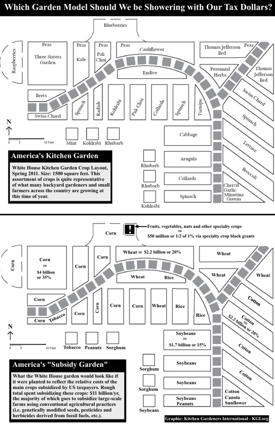
I saw another chart today, twos diagrams of the White House Kitchen Garden:
The first diagram is full of the diverse bounty of late spring: an assortment of leafy green veggies, root veggies, varied salad greens, peas, and blueberries that, come summer, will shift into tomatoes, eggplant, peppers, and beans. These kinds of foods are passively supported through things like, well, the White House Garden. It's bounty and diversity are subsumed by a quaintness, an utter lack of seriousness. In the second diagram, we see serious agriculture. It's serious for a number of reasons, not least of which is the fact that it is actively supported through government subsidies and is so cheap and so plentiful that it finds its way into our diet from all angles: a monoculture of starch in the form of corn, rice, wheat, and soybeans. The idea of MyPlate is to make sure people eat a veriety of the right foods, it hopes that its vageries will be interpreted to reflect the White House Garden. How quaint. The reality is this:
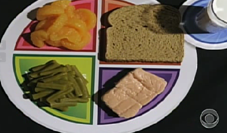
Yummy. Dry, brown, corn syrup-laced slurry bread is the "grain"; corn syrup-soaked mandarin oranges are the "fruit"; sad, canned, overcooked green beans represents the vegetable; and protein looks, well, like protein, you know, that stuff they're growing in labs these days. Oh, and don't forget the delicious corn-fed, denatured (pasteurized, homogenized, and defatted) 2% milk. THIS ISN'T A MEAL, PEOPLE! THIS IS CATEGORIES. Neat, tidy, bland-ass, fat-free categories. Call it food segregation. Everything is orderly, everything is in its place. On a standardized test, this meal would get an A. This type of eating, through MyPlate, is what we are culturally subsidizing. When we teach our children how to eat, this is what we want them to have. Trouble is, they don't want to eat it anyway. I mean, who would? What in the world is appetizing about MyPlate? This interpretation (and it is the dominent one in school cafeterias) supports a false dichotomy: good food tastes bad, bad food tastes good. They are rarely given the option of good food that also tastes good. Children will eat what tastes good. What tastes good and is also good for you? A meal. Foods that go together, that harmoniously blend and meld through the medium of fat, that are fresh and in-season, that are whole, that satisfy our appetite by giving us both the calories AND nutrients as well as the combinations that help us metabolize those nutrients that we need to make it though the day with energy and alertness. But we don't do this, and so, our children will keep eating their onion rings.
Bill Cosby is right. We have hemmed and hawed about what we eat and what we should eat, we have consulted experts, read the science, considered the needs of our agricultural economy, hired a graphic designer, written speeches, and pass out pamphlets. Indeed, it takes a lot of thinking and work to keep from working.
